Skip to Main Content

Data Visualization

Data visualization resources and services at the Leatherby Libraries

Best practices

Different types of data and their corresponding plots will have different requirements and needs, but there are a set of best practices that apply across most visualizations. These include:

  • Don't clutter the visualization with unnecessary text or data (referred to as having a high "data to ink ratio").
  • Use accessible colors and alt text.
  • Explain what is happening in the viz in captions.
  • Don't alter your scales to deceive readers about your data.
  • Represent uncertainty when it exists.
  • Visualize raw-as-possible data when possible, rather than derivatives.
  • Align text to the left, rather than centered.

Resources for different areas of best practices in data viz are linked below:

Examples

Examples

Here's an example from the first blog linked below, "Five qualities of great visualizations". The plot on the left is poorly designed; the plot on the right is cleaned-up.
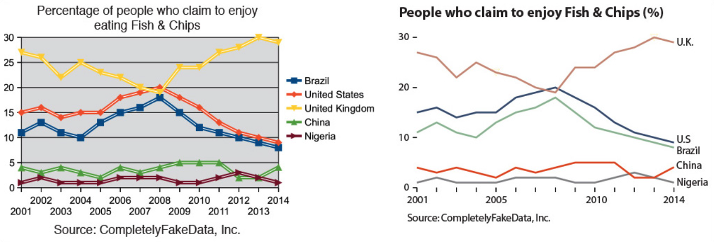
Notice:

  • The background is white, and the horizontal grid lines have been removed. The lines that represent data have more visual weight.
  • The x-axis labels on the right are less cluttered, relying on tickmarks to show individual years.
  • The dot-and-line plot on the left doesn't gain much from the presence of the dots. The difference between years is far smaller than the y-axis labels, so it's impossible to accurately judge what the dots represent numerically anyways.
  • The plot on the right gets rid of the key, and simply labels the lines directly instead. This again reduces clutter and makes the plot easier to read. The plot on the left is also using both the shape of data points and color to identify lines, which is unnecessary - one or the other suffices.
  • The title is all on one line, is bolded, and left-aligned.

Here's a second example, with a more complex plot and no "bad" comparison.

This example comes from the data visualization blog FlowingData, and visualizes the change in the theft of specific brands of cars following the spread of a viral TikTok showing how to hotwire them via their USB ports.

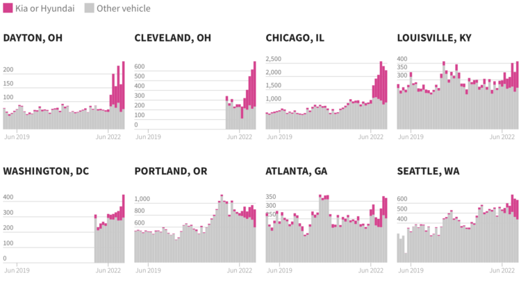
We're looking at a grid of 8 stacked bar plots. Stacked bar plots let us compare a few numerical categorical variables across  There are several things to notice:

  • The y-axes are scaled to use as much of the space alloted per plot as possible, but this means that one plot cannot be directly compared to another city's plot. However, the x-axes are the same across the plots, to help readers see that the uptick happened at the same time across all the cities shown.
  • A strong, eye-catching color is chosen to highlight the data of interest, the number of the specific car brands' vehicles stolen. Cars of other brands are all aggregated together and represented simply in grey.
  • It's hard to see the exact size of the changes of the magenta and grey bars each day, but that's not the information the designer wanted to communicate - the changing proportion of magenta to grey is.

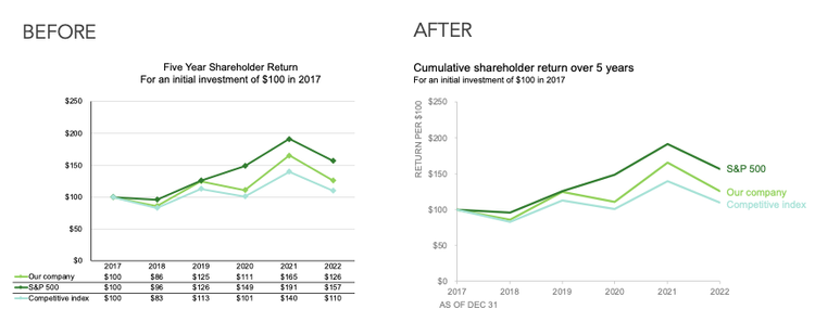
A third example is the blog post "what clutter can we eliminate?" by Elizabeth Ricks on the blog storytellingwithdata,com.

Ricks shows the process of improving a "cluttered" and difficult to read plot, incrementally making changes to remove extraneous elements and make a plot easier to grasp the meaning of. Note that what may be "clutter" for one visualization may be very important for another! In this case, however, Ricks' example visualization aims at being quickly and clearly understandable.

Blog posts

Journal articles

Camm, J. D., Fry, M. J., & Shaffer, J. (2017). A Practitioner’s Guide to Best Practices in Data Visualization. Interfaces, 47(6), 473–488. https://doi.org/10.1287/inte.2017.0916

Midway, S. R. (2020). Principles of Effective Data Visualization. Patterns, 1(9), 100141. https://doi.org/10.1016/j.patter.2020.100141

Rougier, N. P., Droettboom, M., & Bourne, P. E. (2014). Ten Simple Rules for Better Figures. PLOS Computational Biology, 10(9), e1003833. https://doi.org/10.1371/journal.pcbi.1003833

Readabilty

Accessiblity

Alt text for data viz

Colorblindness-checking tools

Equitability and avoiding stereotypes